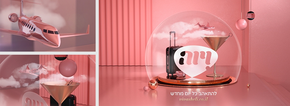
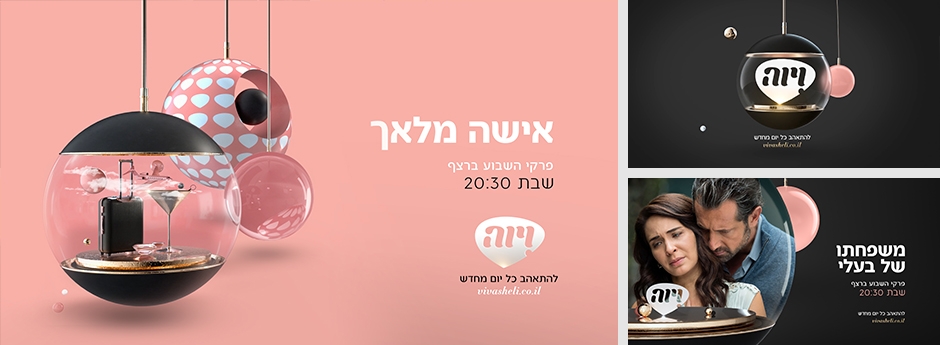
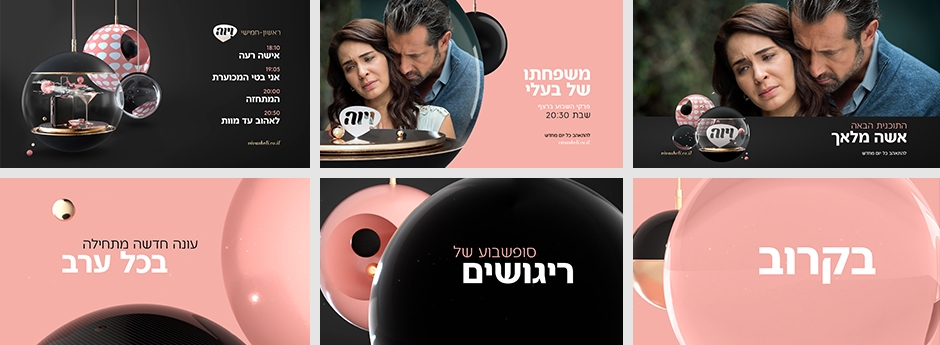
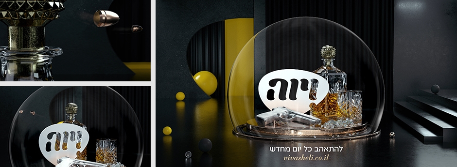
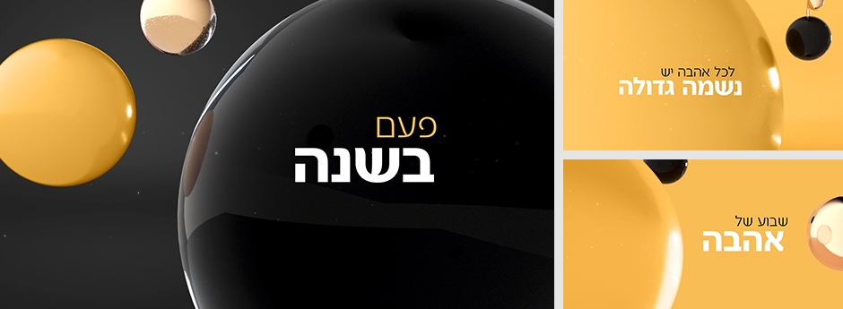
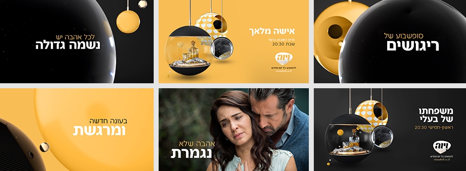
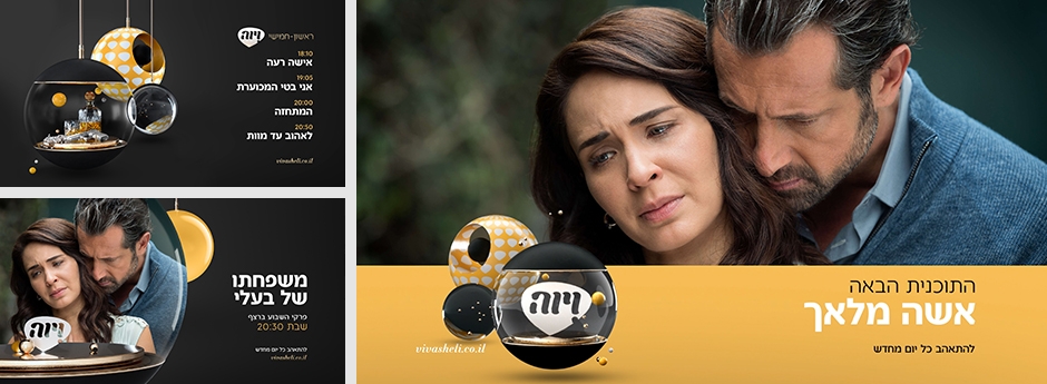
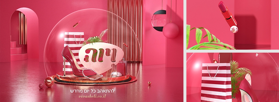
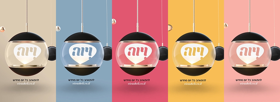
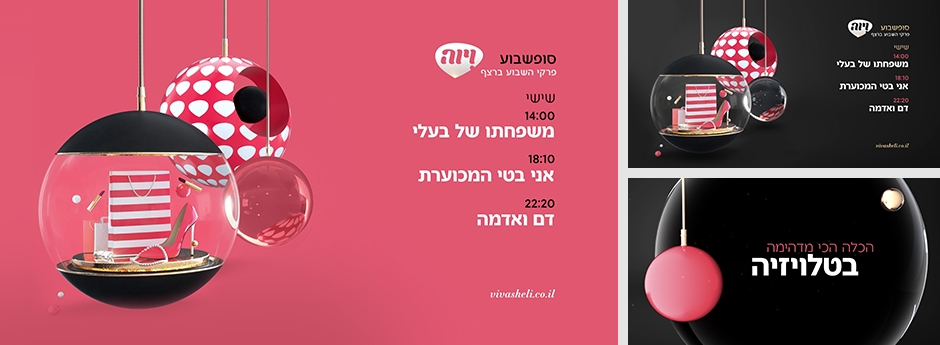
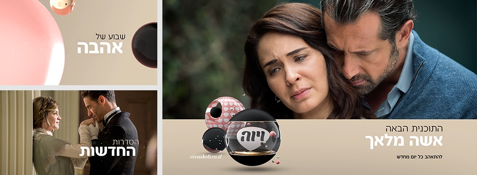
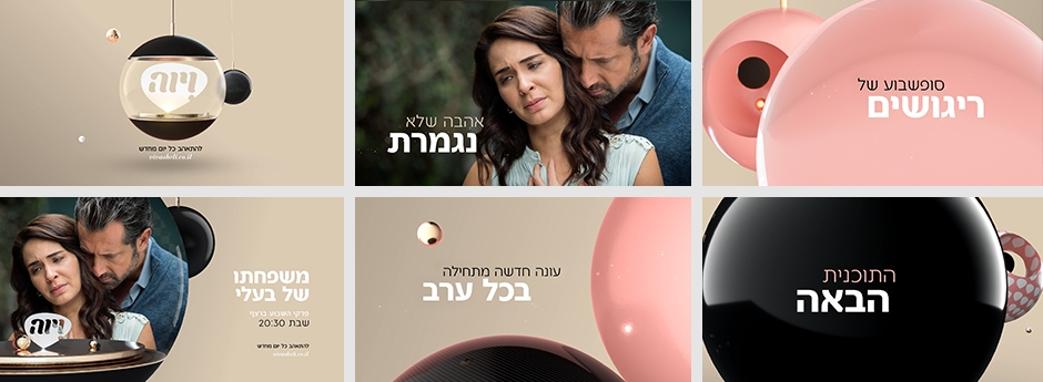
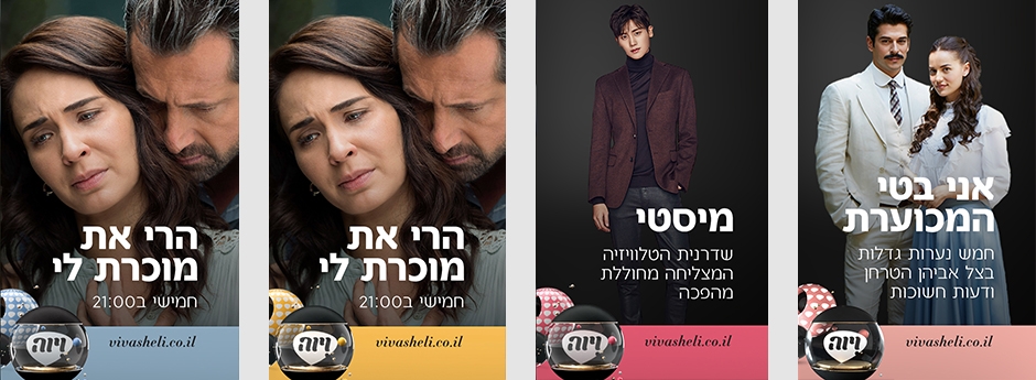
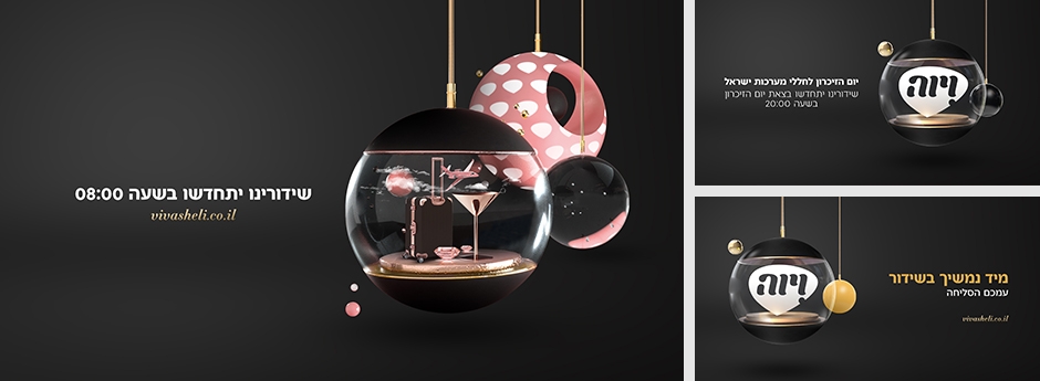
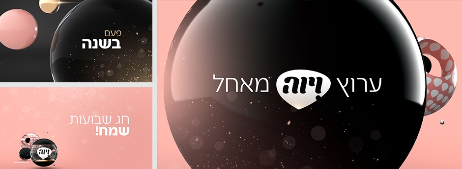
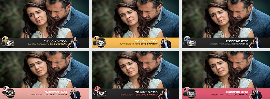
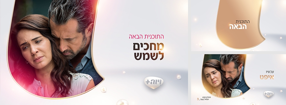
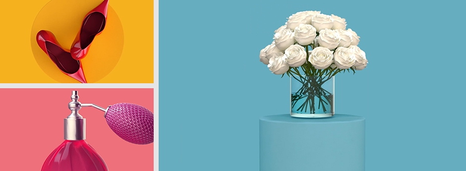
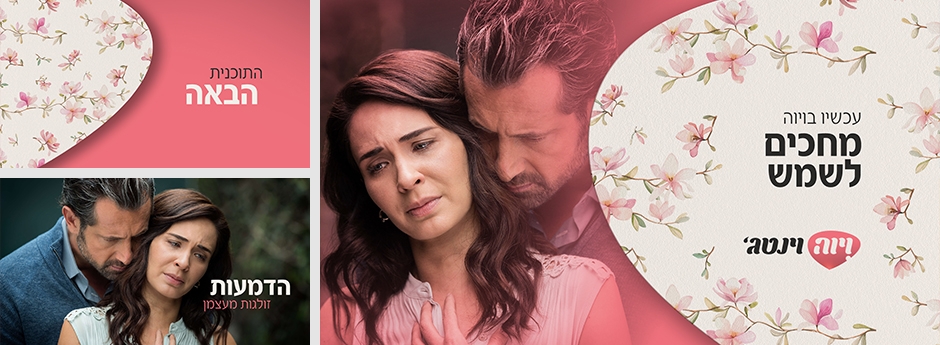
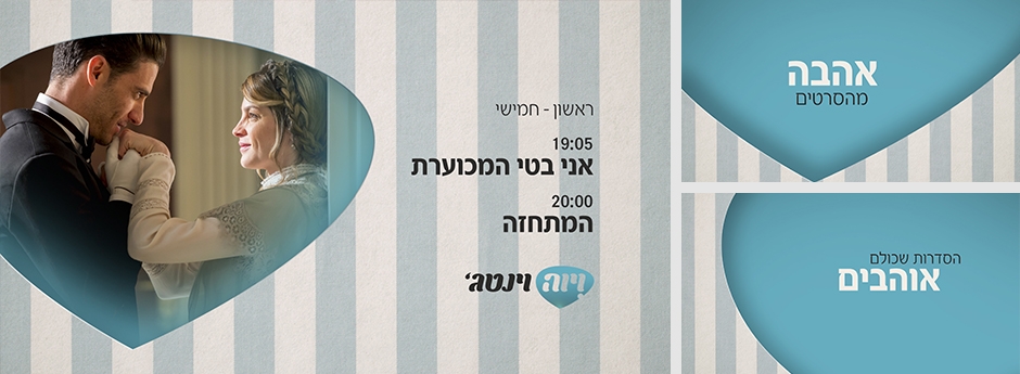
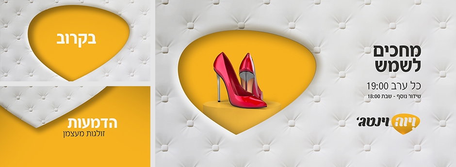
We have rebranded the leading national daily drama channel, Viva, that consist of the main channel, the Premium channel and the Vintage hours. A unique look and style was created for each one, keeping a connection between the various channels.

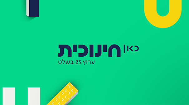
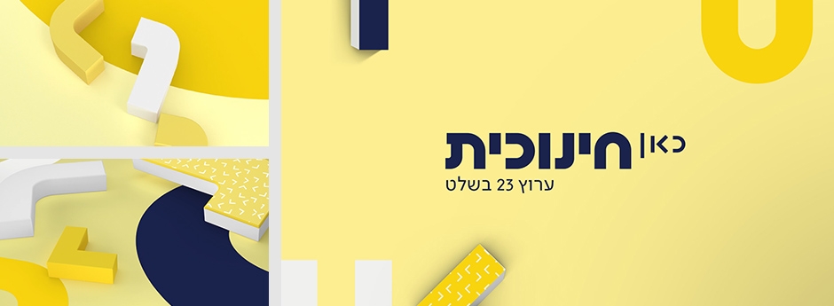
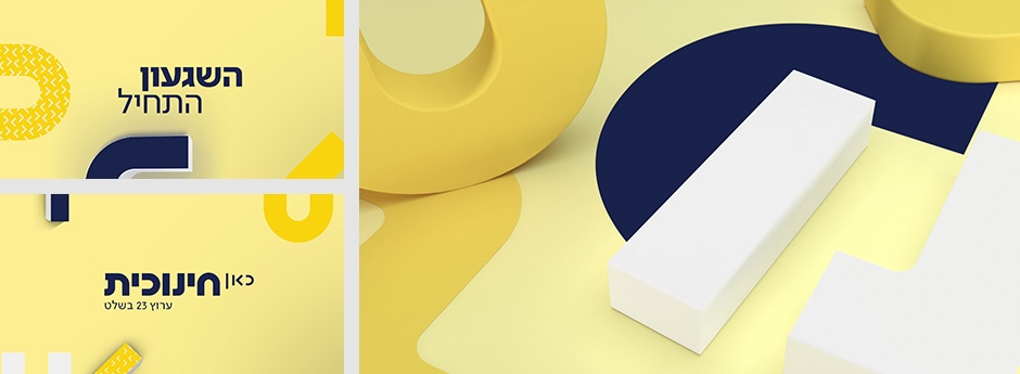
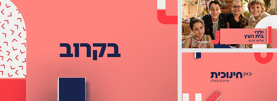
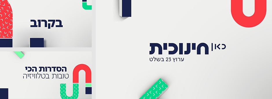
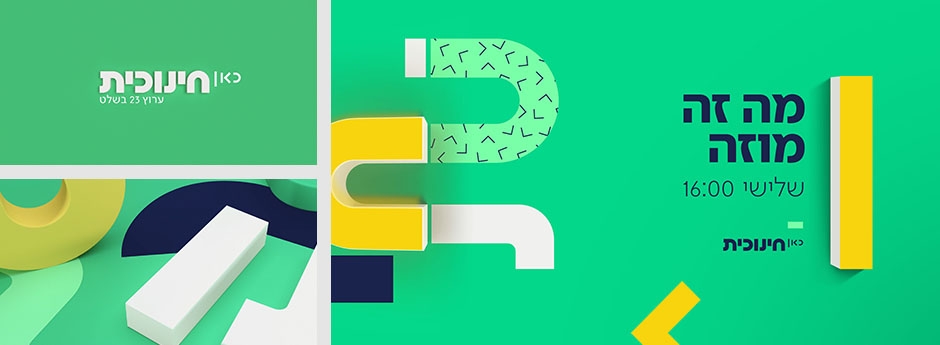
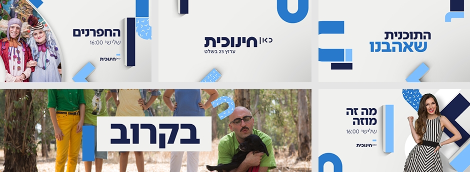
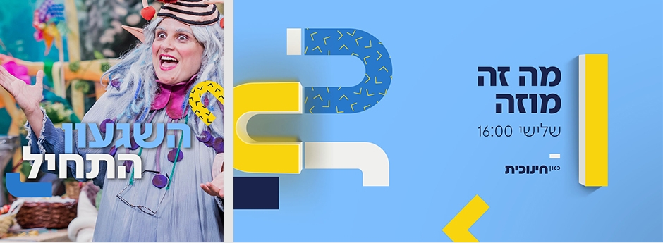
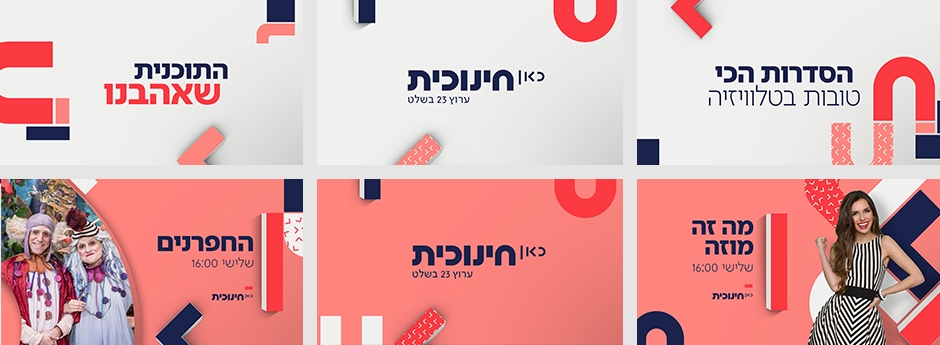
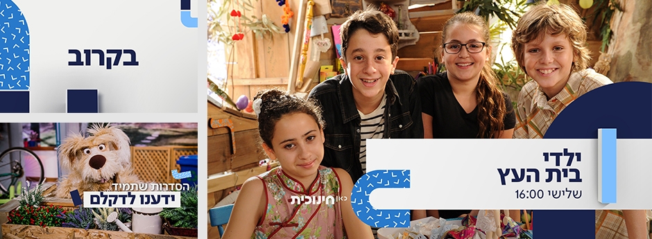
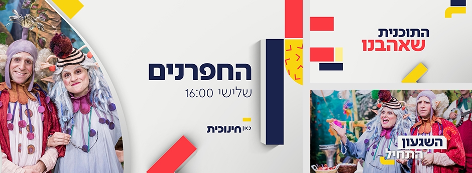
Branding for the national broadcasters educational kids TV. We rebranded the 40 year old channel, to suit the new affiliation and ownership by KAN, the national broadcaster. Based on the logotype designed for KAN (by studio Firma), we created the offspring of a new puffier and playful logo based on the shapes in the master unit. The main logo characters were reassembled into a system of playful shapes and colors, that were selected to resonate the naïve, fun and safe educational environment the channel wished to portray.
מיתוג מחדש של ערוץ כאן חינוכית.
סטאף סטודיו אדם פיינברג
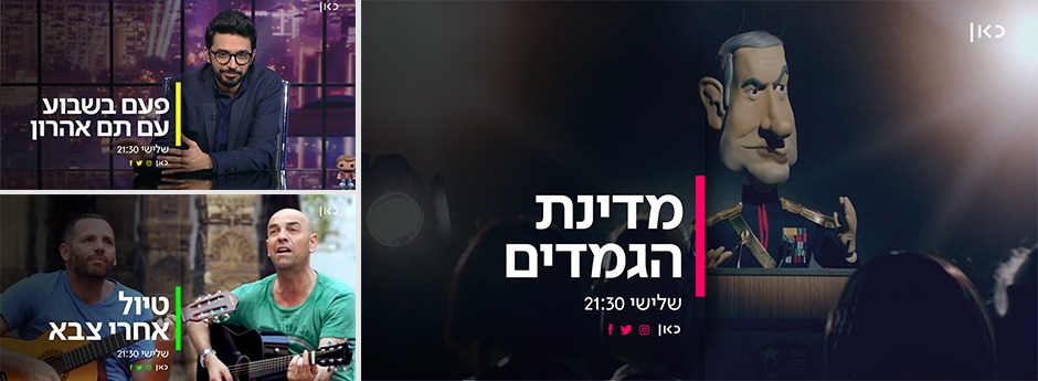
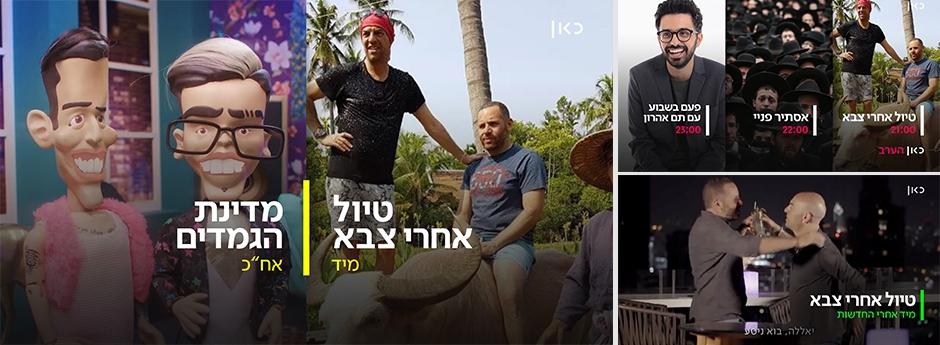
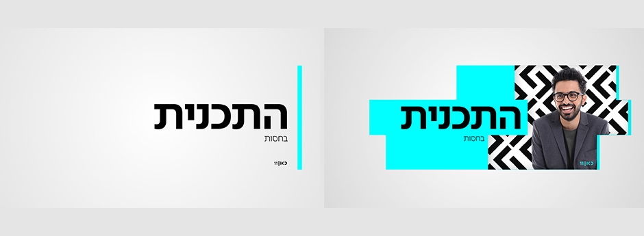
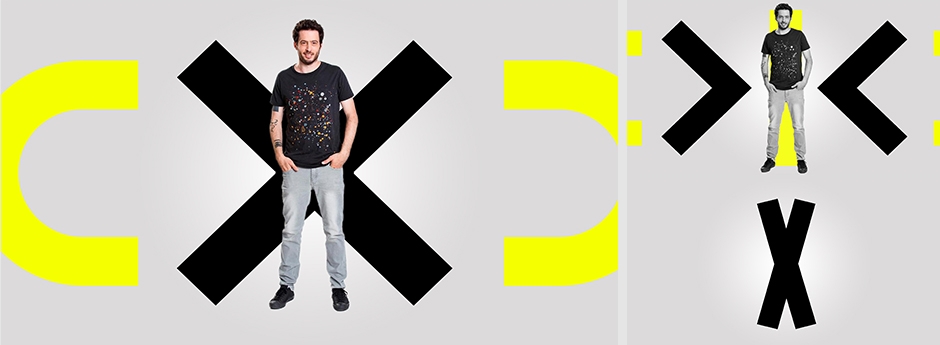
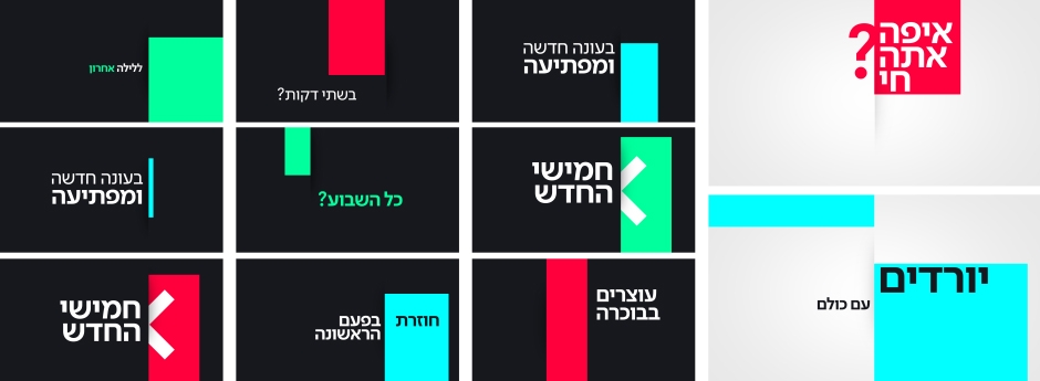
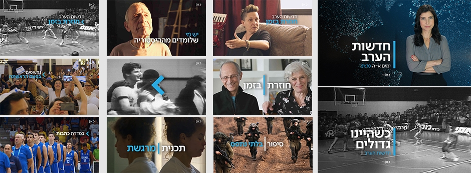
We were approached by the new national Public Network, Kan 11, to create a complete screen makeover based on their new logo and dominant central line, used across the various platforms. We wanted to create a fresh young look that will stay appropriate for all content, by taking the "line" element from the logo and expanding it across the screen to mark, open, toggle, and shift displays.
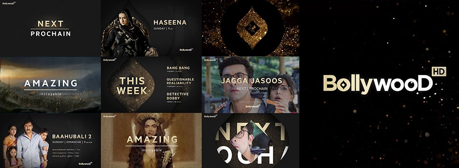
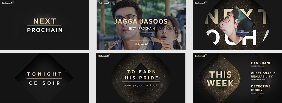
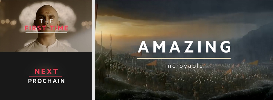
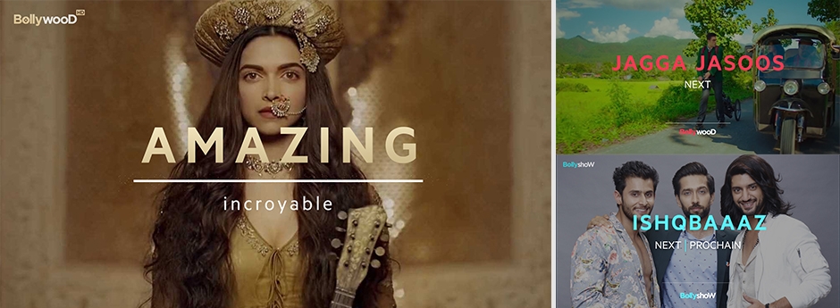
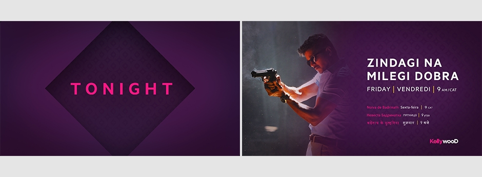
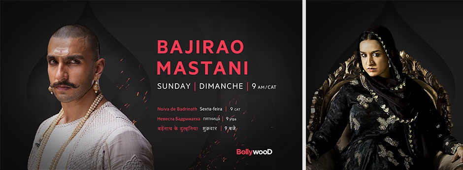
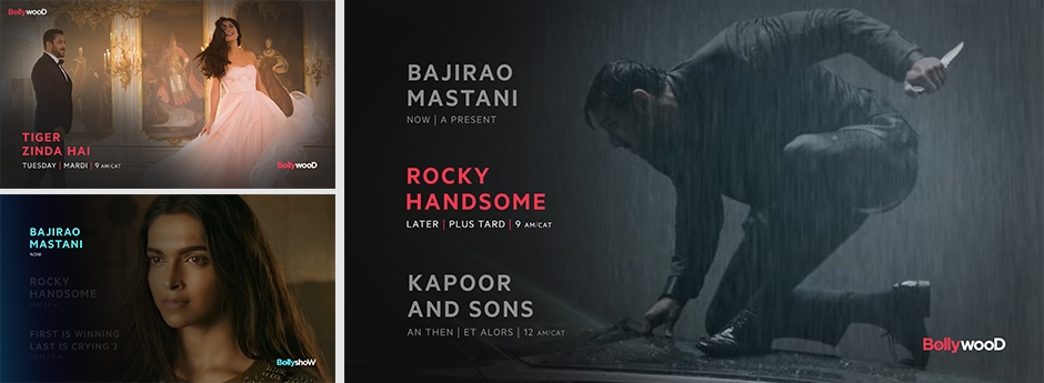
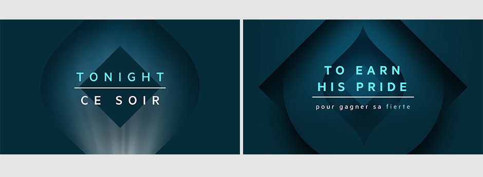
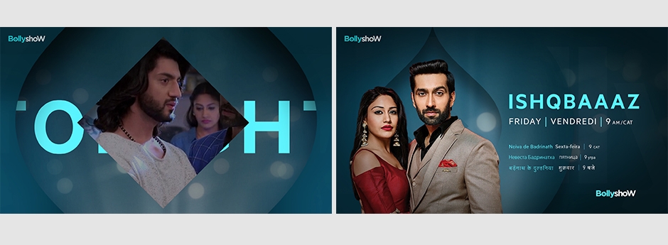
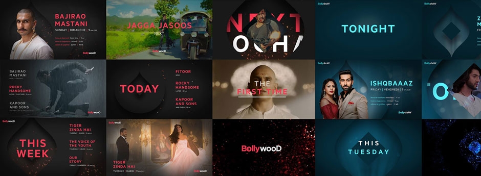
A complete branding work we created for the international Indian movie network "Bollywood HD". Our goal was to create an identity for movie channels that could showcase the rich and powerful imagery of the Indian Cinema. The brand should be dominant and coherent ,yet be able to change its tone according to the content displayed, ranging from enormous block busters to low budget gems.The network consists of four channels, broadcasted in a dozen languages, across Africa, Eastern Europe, Russia and parts of Asia. We had to create an information system that could eventually be automated and deliver content in a multitude of languages, up to nine languages simultaneously. This was a great challenge, and we are very happy with the end result.
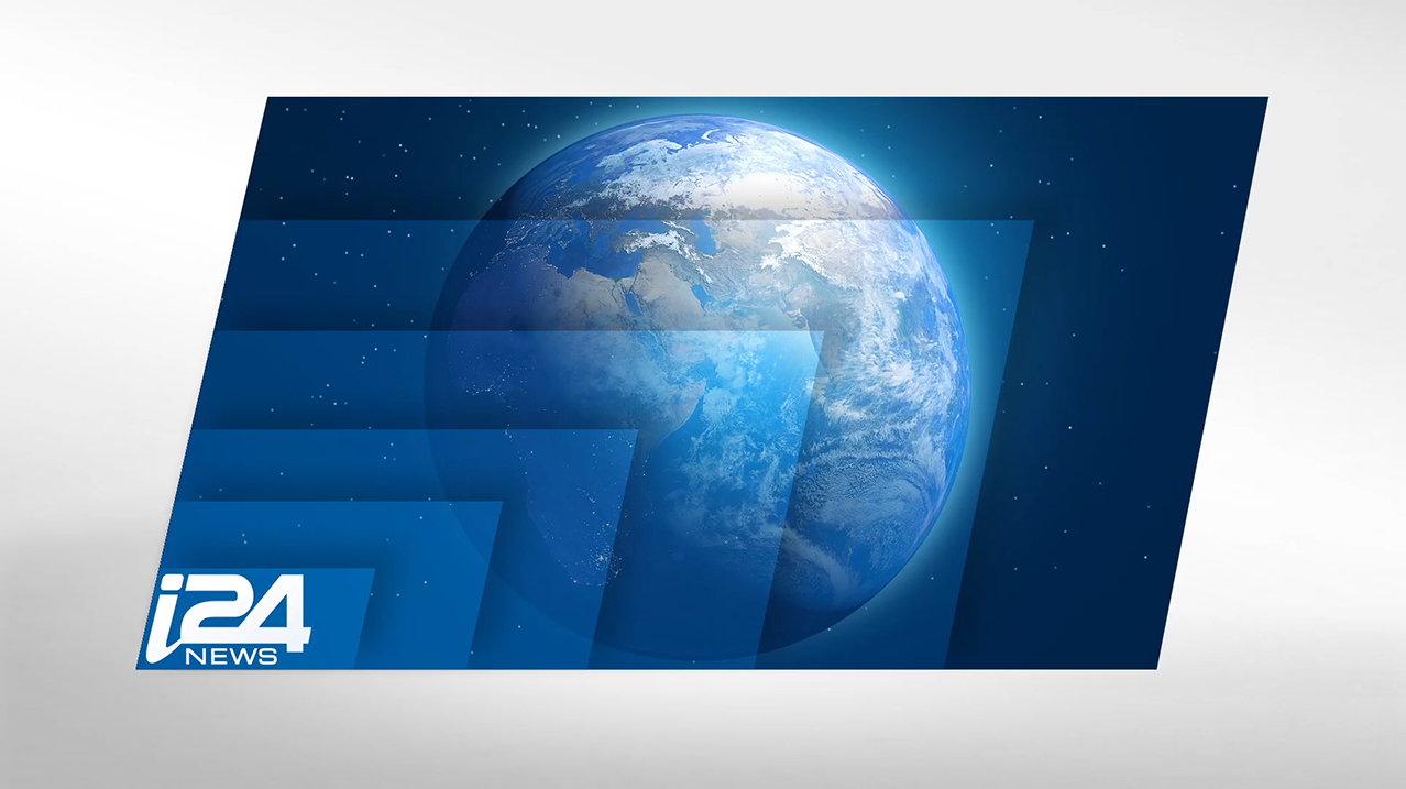
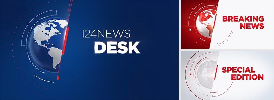
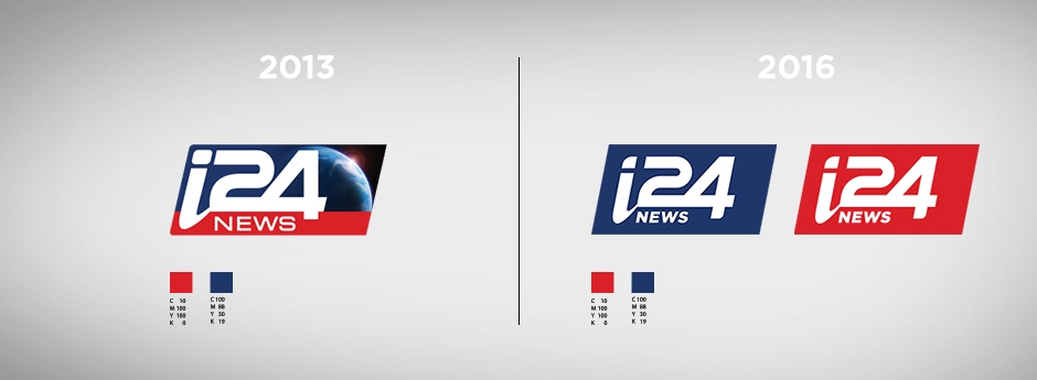
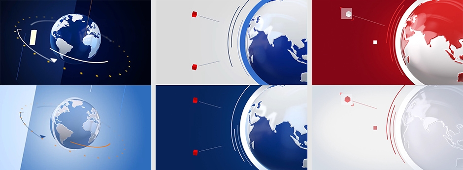
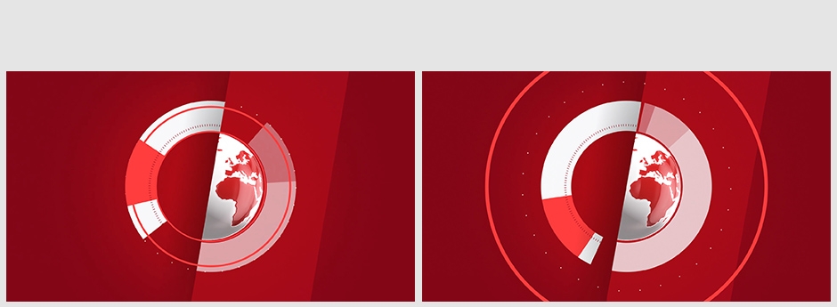
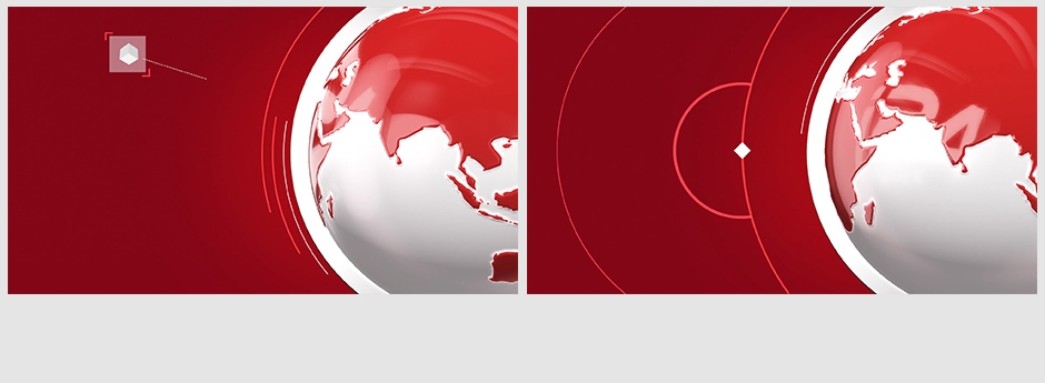
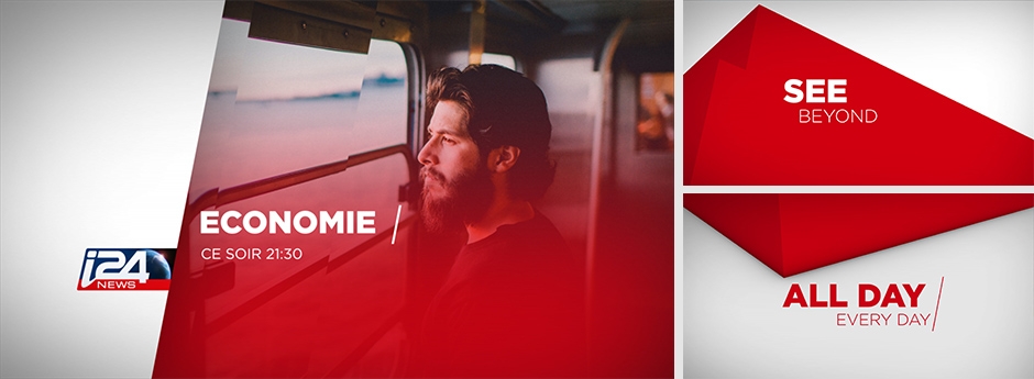
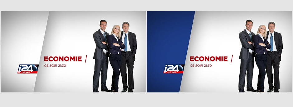
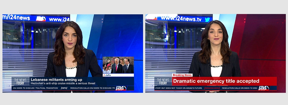
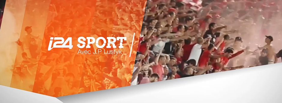
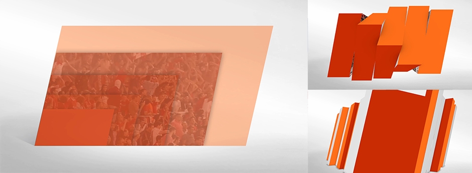
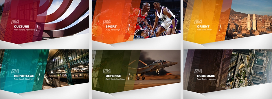
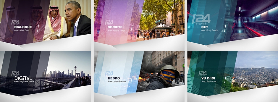
We have had the privilege to work for the international news agency i24 for several years. The channel broadcasts news from the Middle East in three languages - French, English and Arabic.
Working tightly together for over 4 years, from the day of the channel launch till today, has been an evolving and fascinating process. Keeping the channel up to date on all aspects, in 2017 we refreshed the channel logo, the openers for all news items, the promo package and the majority of the studio elements.

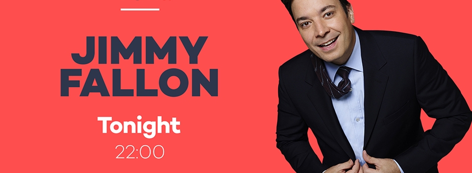
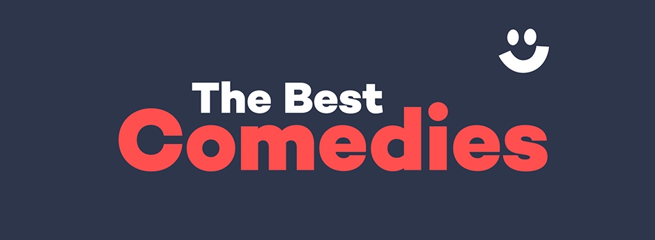
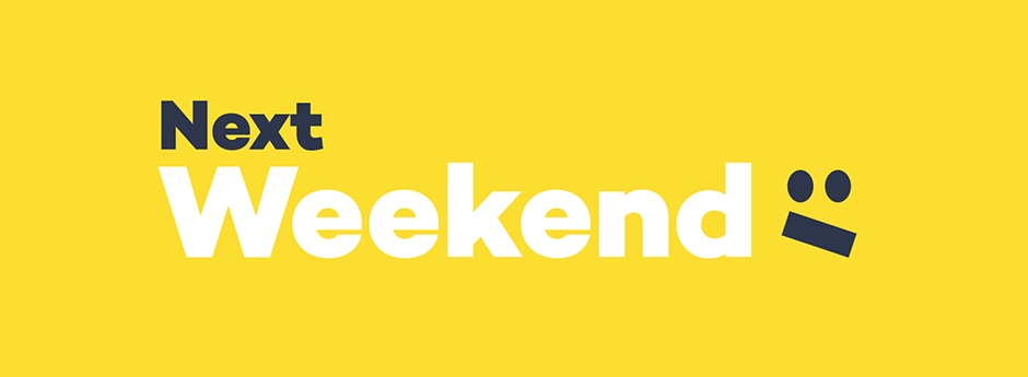
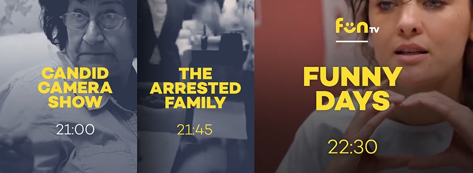
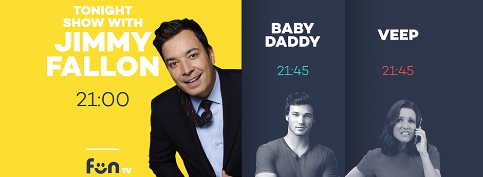
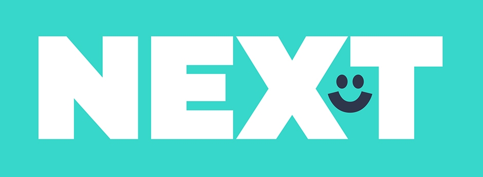
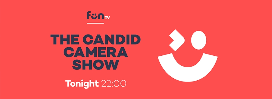
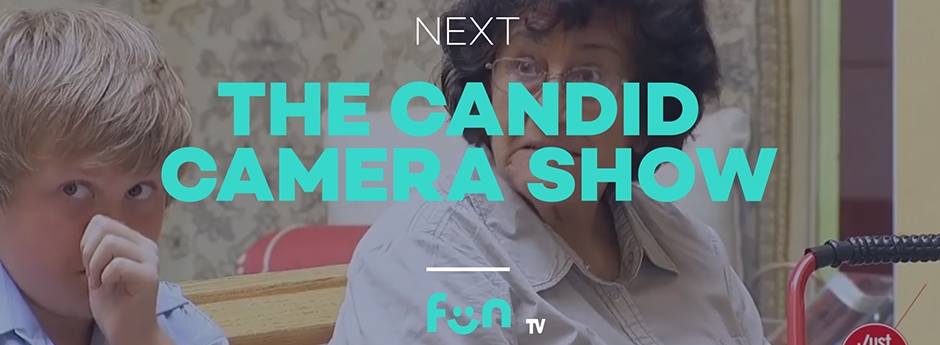
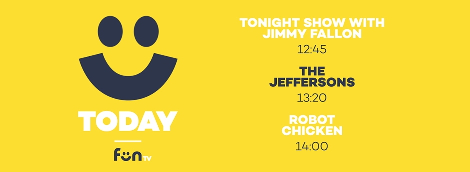
Channel Branding for an international comedy channel, FunTv, focusing mainly on gags and viral videos. Because of the multitude of sources and the many compilations of short videos, we needed to establish a very dominant presence of the channel brand. We created a young a fresh pallete, very dominant graphics and the smiling face, in order to maintain the strong visual presence of the brand throughout the daily broadcast and on screen. In the short production time, roughly three weeks, we started from the branding and strategy, through design, creative, animation and full brand and working kits for future use.



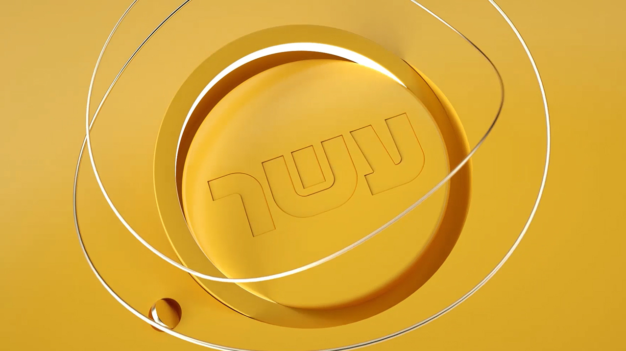
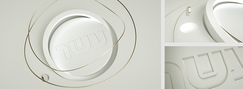
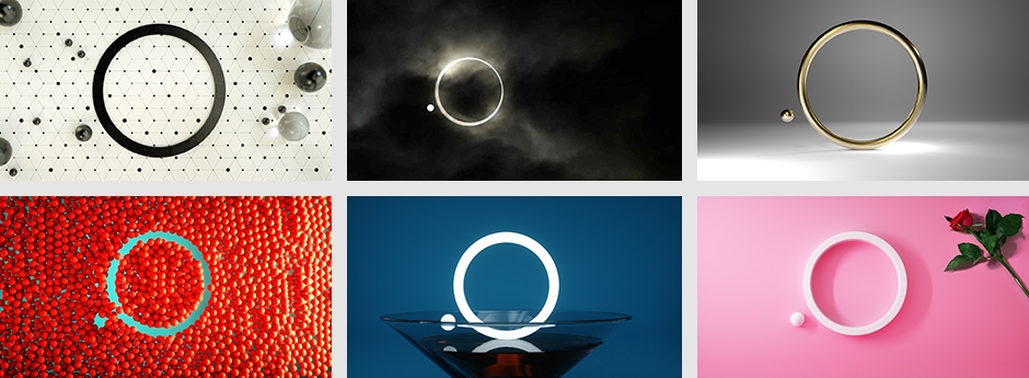
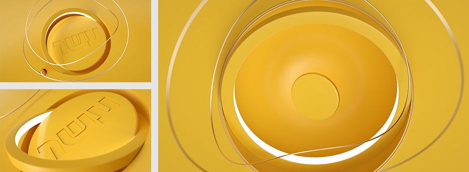
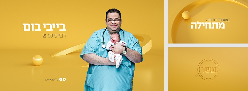
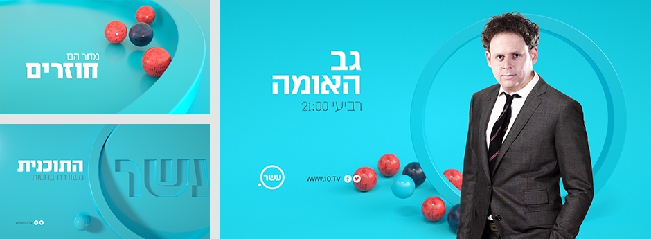
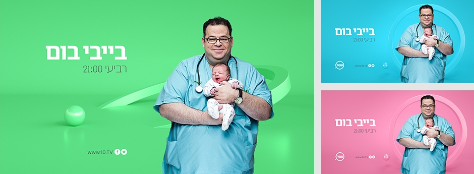
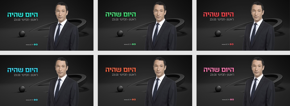
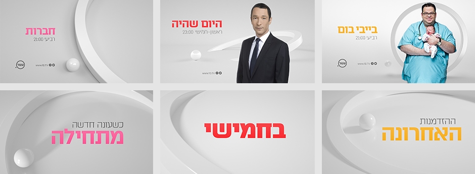
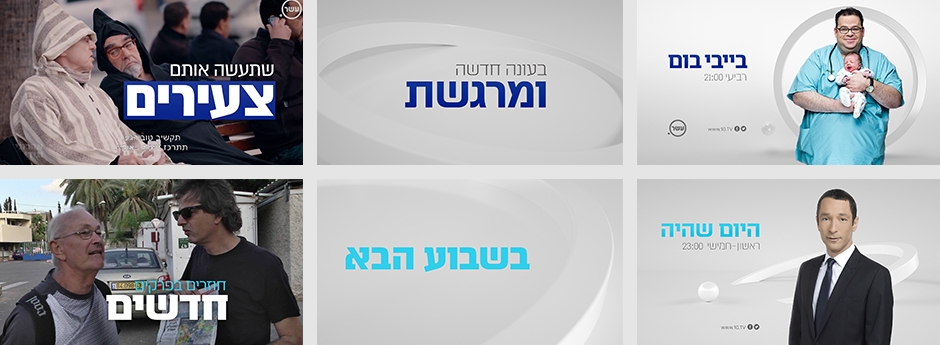
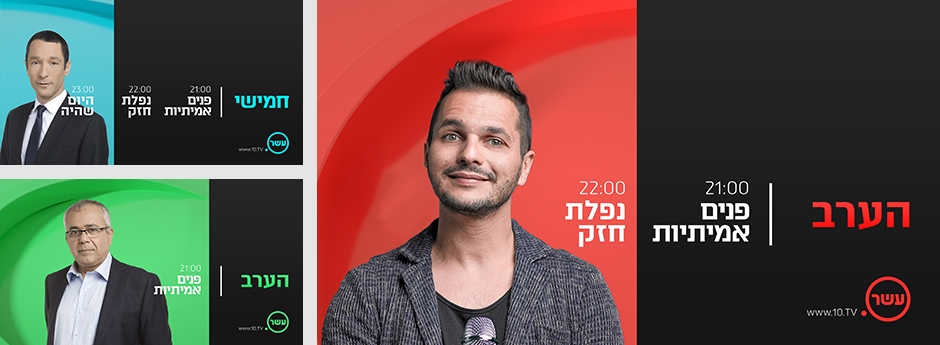
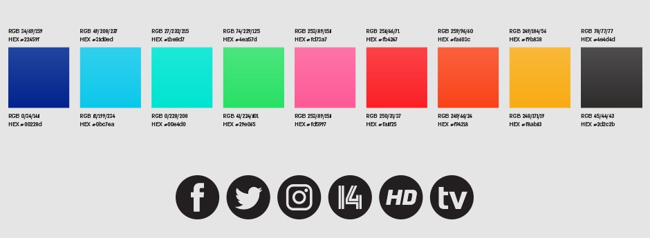
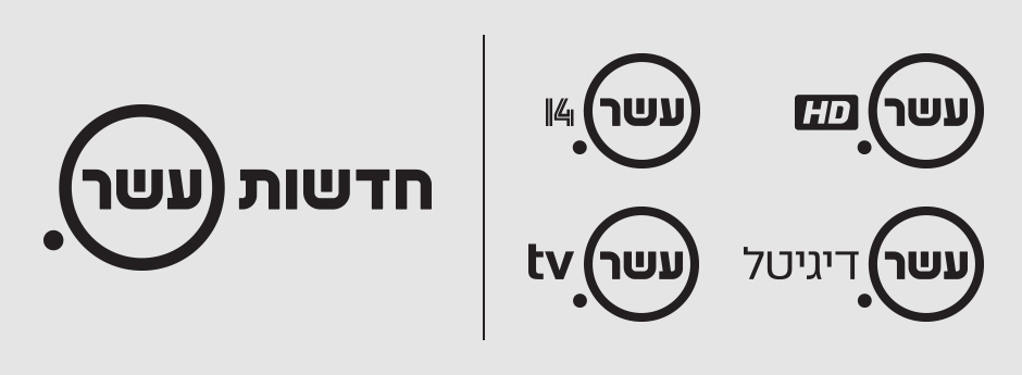
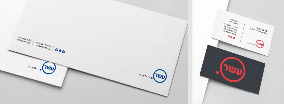
We were approached practically a month before launch to create a total re-brand for one of the major broadcasters in the country, Channel 10. They were no longer allowed to use the number 10, yet wanted to maintain the name "ten" (eser). We created the entire brand and online work in less than five weeks. The compilation of branding and the on screen work for the channel.
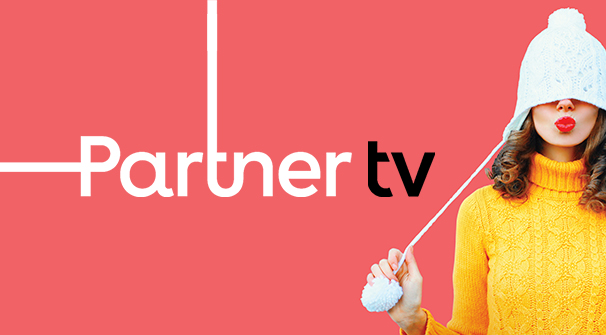
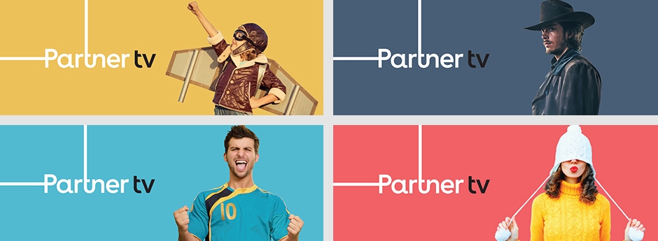
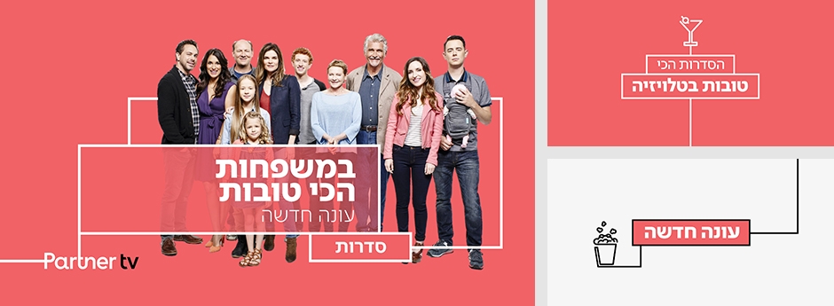
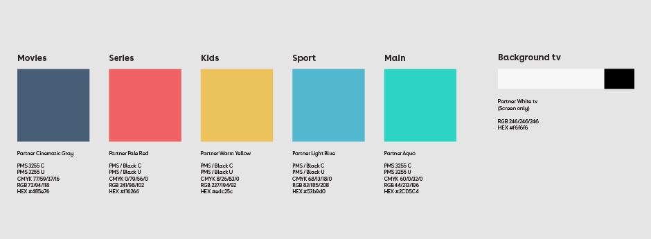
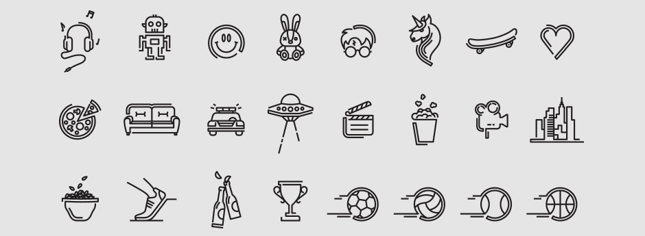
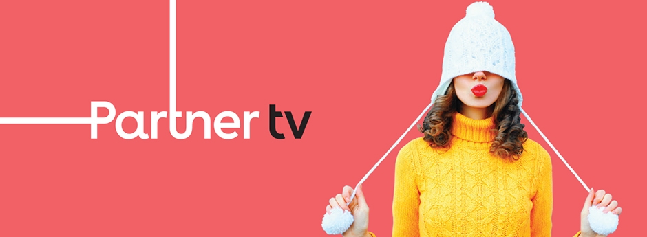
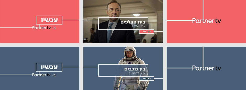
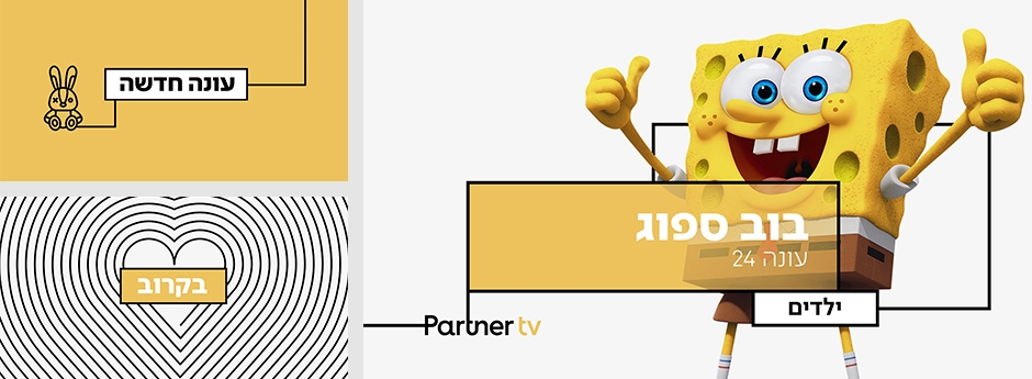
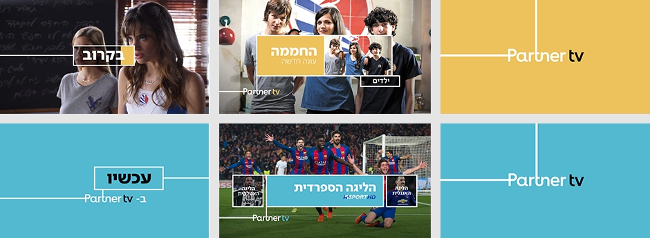
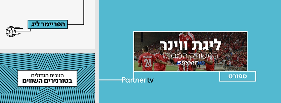
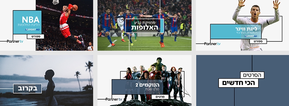
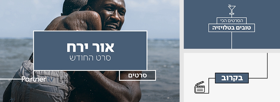
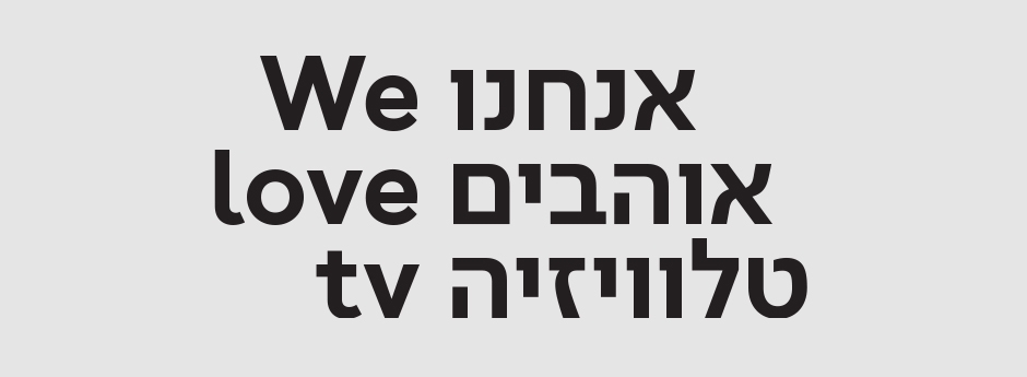
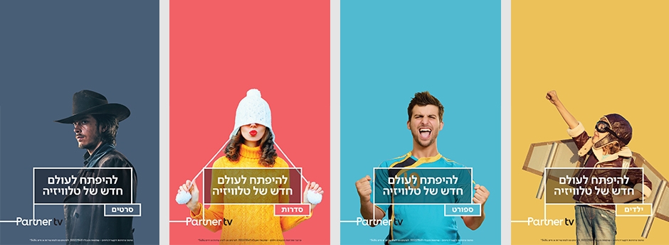
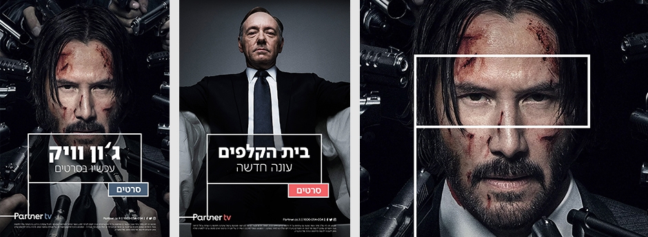
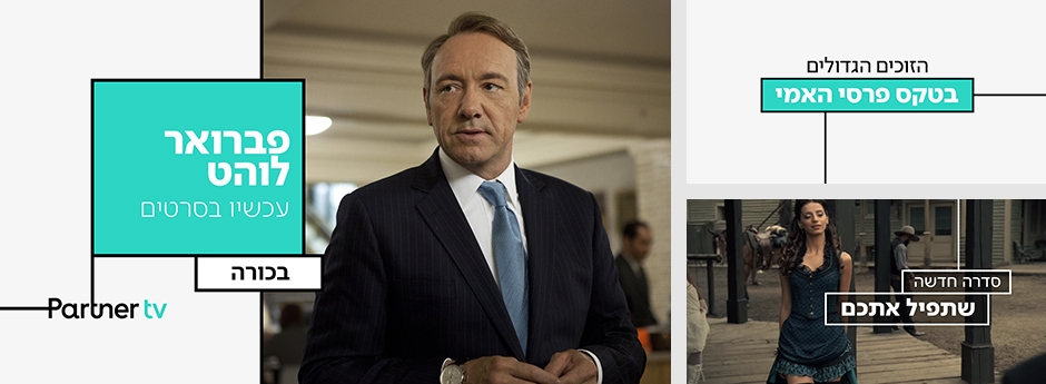
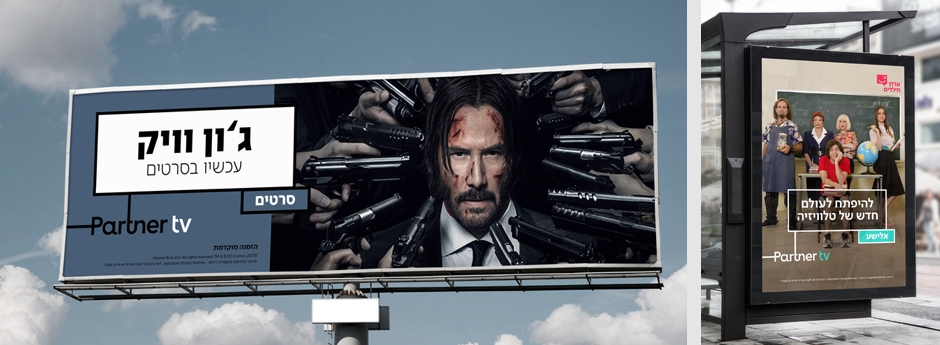
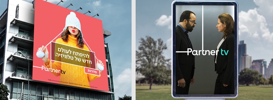
We were approached by Partner to create the channel branding for Partner TV. We extended the monochromatic corporate brand created by Metadesign in 2016, by adding colors, animation, icons and adapting the typography and grid to support the magnitude of promoting varied media across many platforms. We love the result, that has in effect resonated into the entire Partner brand.
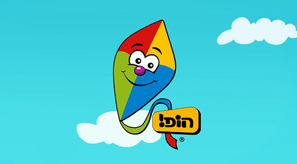
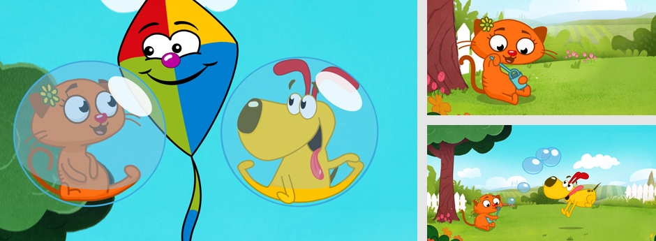
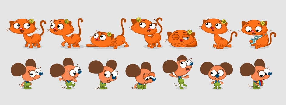
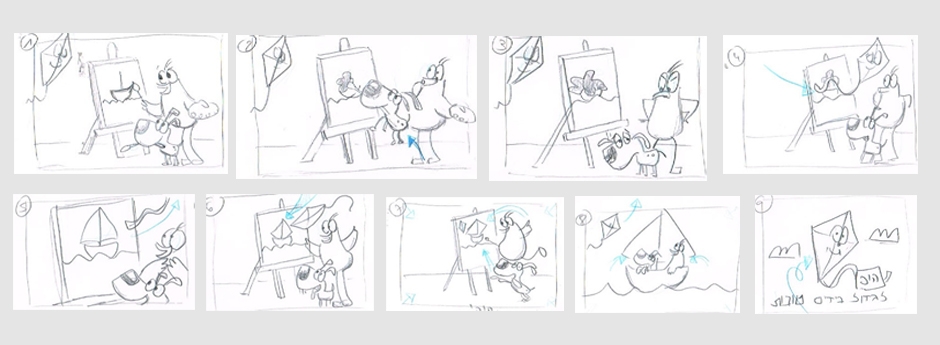
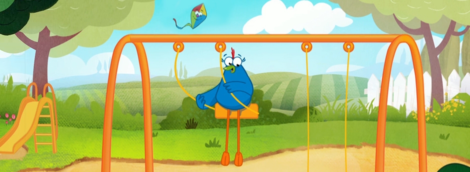
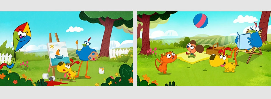
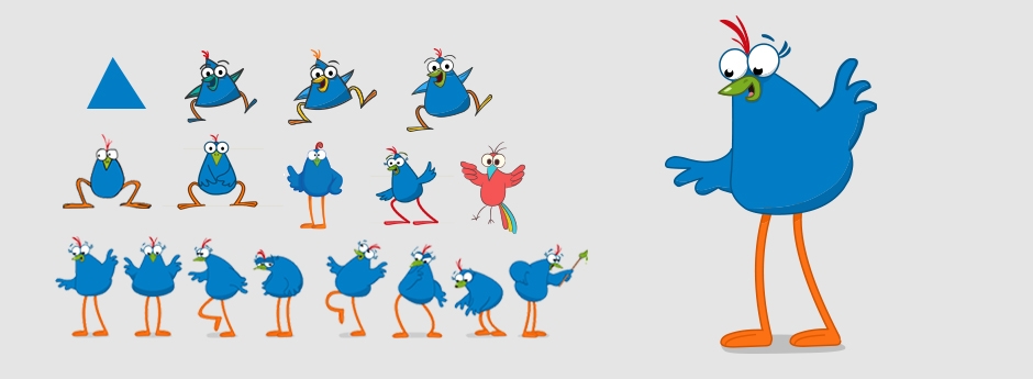
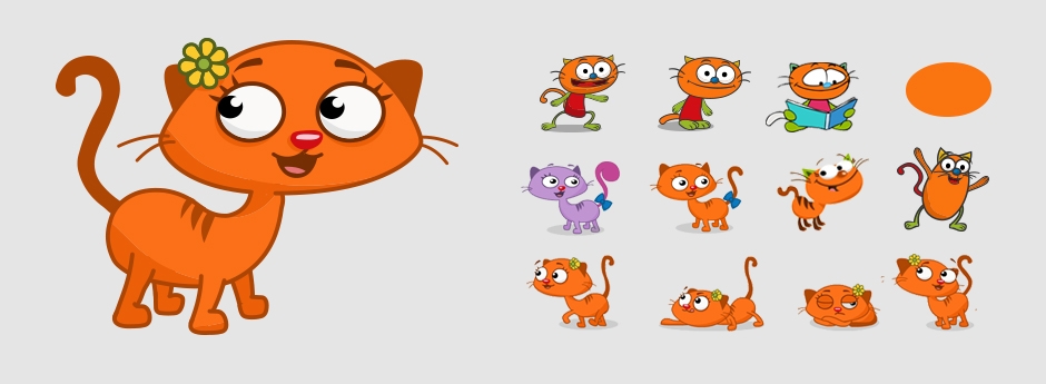
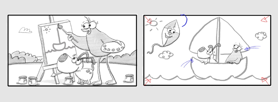
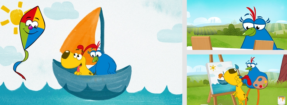
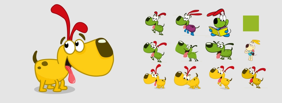
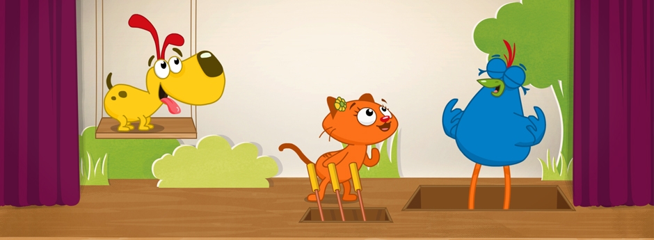
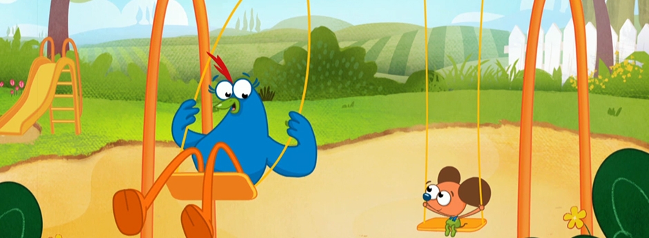
We were approached by one of the most prominent kids TV channels in the country to rebrand their IDs and characters. The cast of animated figures have been an icon for over a decade, and while briefed to stick as much as possible to the original characters, we set out to refresh and update as much as possible. Once developed and branded, we produced a set of short story ID’s, focusing on things small kids could identify with - solving problems, helping each other & having fun.
Client: Hop
Production Company: ST/AF
C. Director: Adam Feinberg
Animation Director: Neta Holzer
Music: Yoni Bloch
ערוץ הופ - מיתוג דמויות ואנימצית מעברונים
סטודיו אדם פיינברג
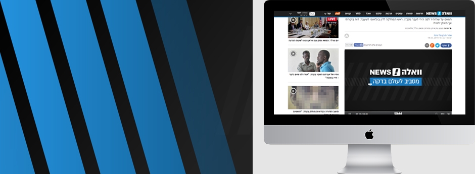
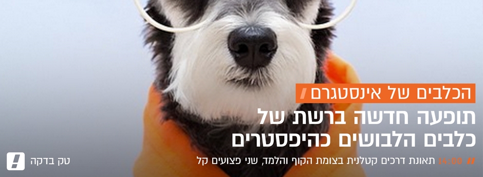
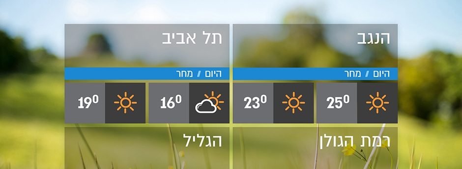
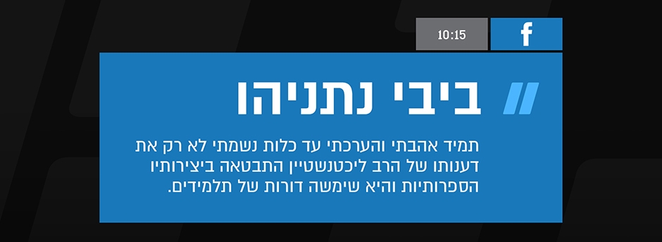
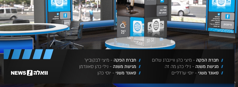
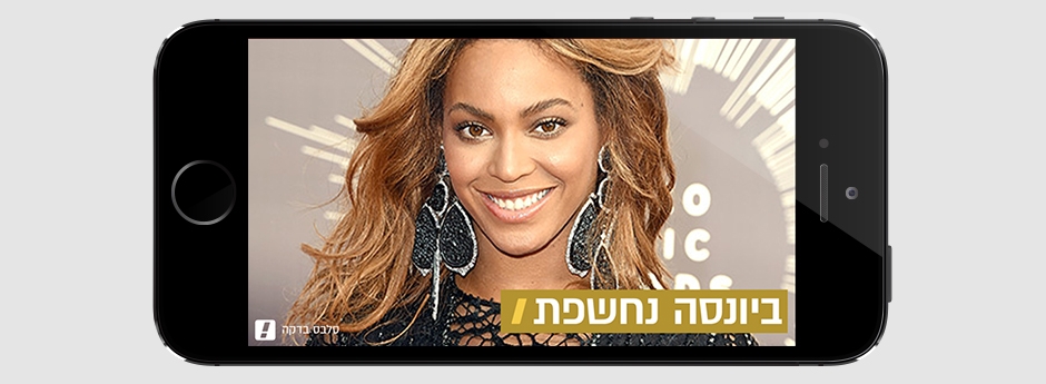
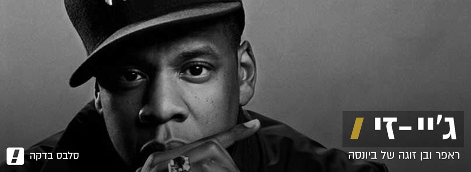
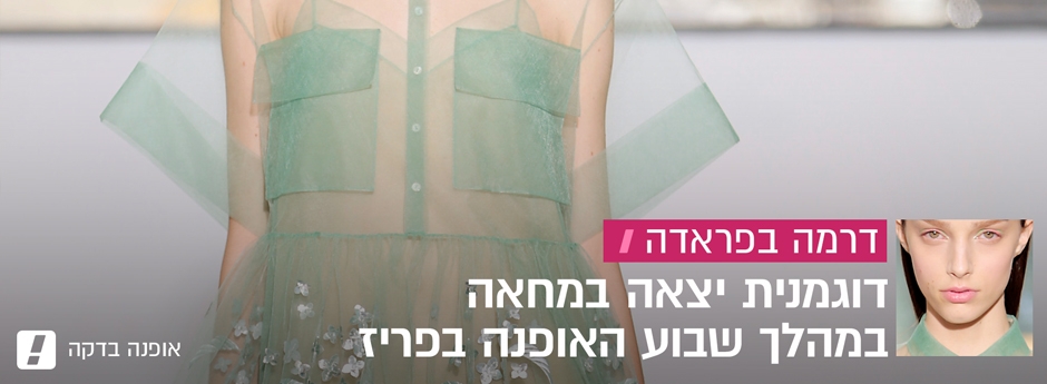
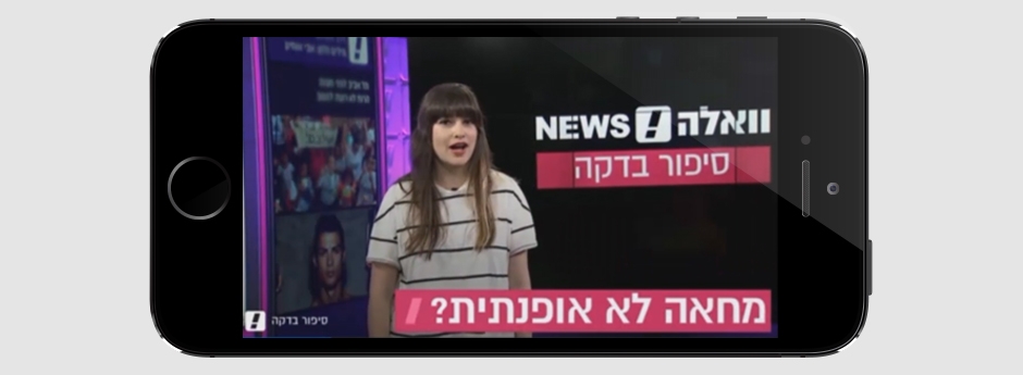
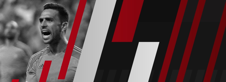
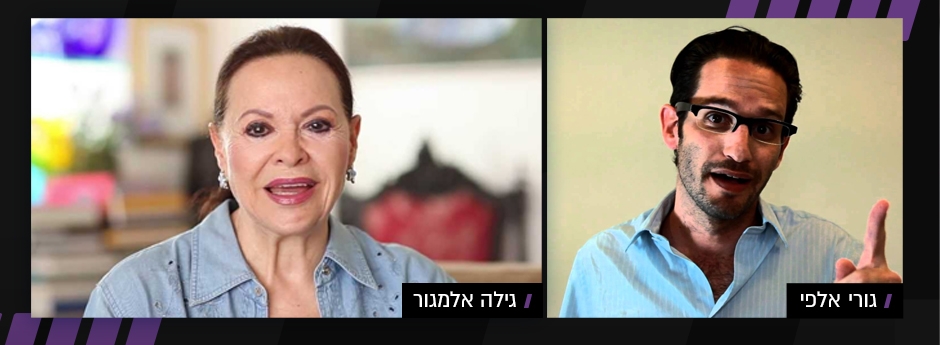
Walla is one of first and largest news portals in the country. As part of their major rebrand, we were asked to create their entire onscreen look for their news, magazine and live broadcasts.
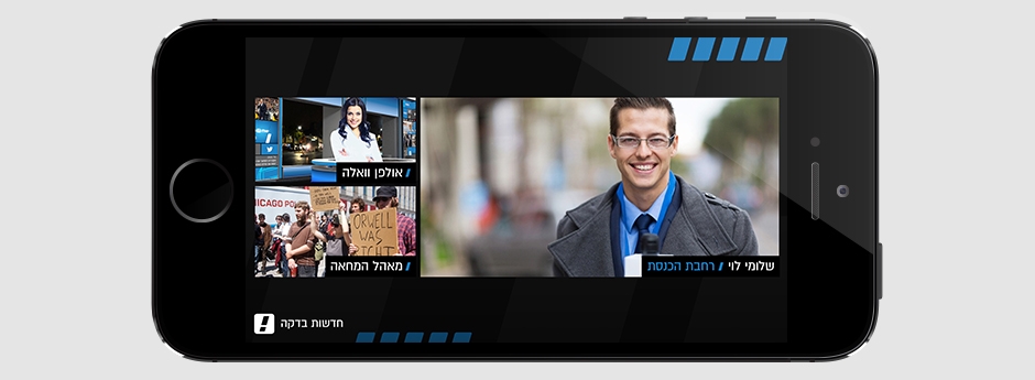
One the major challenges, was focusing on a solution that will look great across all platforms. Aiming at mobile users first and foremost, and to the large XXL screens posted outside the Walla Building, led us to a clear, crisp and minimalistic information design.
We sought to create a look that will differnetiate Walla from its competitors, feel young and sassy, while maintaining the integrity of a news provider. We created a large number of unique elements in design and animation, together with complex templates that can work across all magazine palletes in realtime.
וואלה מיתוג מסך
סטודיו אדם פיינברג